Service
Graphic Design in New Jersey
Logos and layouts drawn as vector art for vinyl, print and fabric, so one design reads on a truck door, a trailer, a sign and a shirt.
Graphic design for vehicles, signs and apparel means building a logo and layouts as vector artwork that can be cut in vinyl, printed large and put on fabric without being redrawn. Lombardo Lettering designs that artwork for New Jersey businesses, and vehicle layouts are proofed on a template of your actual truck before anything is cut.
What graphic design means at a lettering shop
Graphic design at a sign and lettering shop is narrower and more practical than design at an ad agency. The output is not a mood board or a campaign. It is a logo and a set of layouts that a vinyl cutter can cut, a printer can print and a shirt decorator can put on cloth, without anyone redrawing it along the way.
The work usually falls into three jobs. Some customers have no logo and need one built from scratch. Some have a logo that only exists as a blurry photo, a business card scan or a small image pulled off an old website, and need it redrawn as clean artwork. Others already have a brand package from a designer and need it laid out on a pickup door, a box truck side, a banner or a storefront window without breaking the rules in that package.
In all three cases the design has to suit the material it ends up on. A vinyl cutter cuts along the vector paths laid out in the design, and the excess film is then weeded away from the liner, so every stroke and gap in the artwork becomes a physical piece of film. Detail that looks fine on a monitor has to be checked against that process, and against the distance the finished piece will be read from.
Recent graphic design work across New Jersey
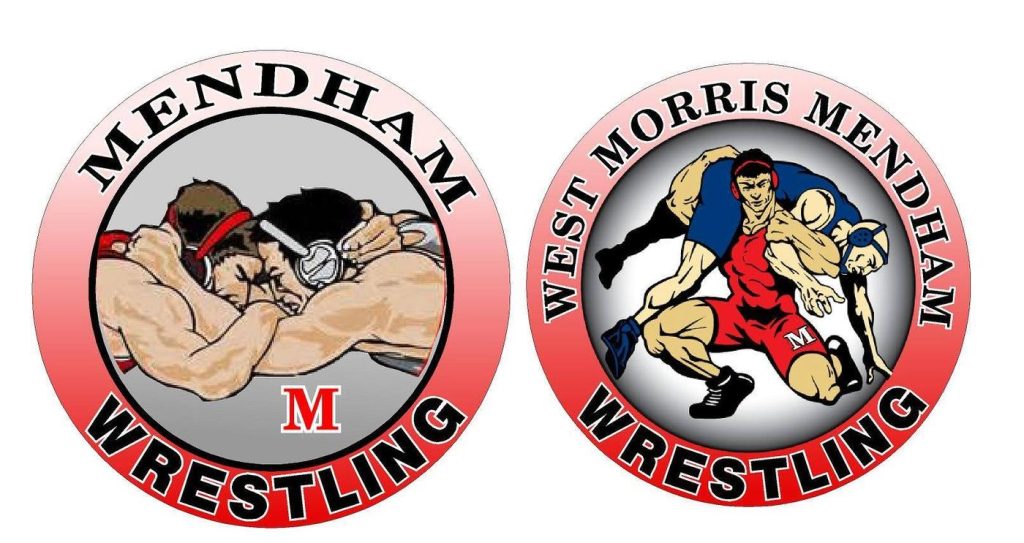
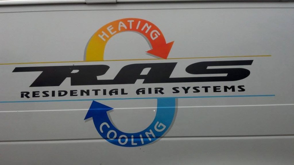
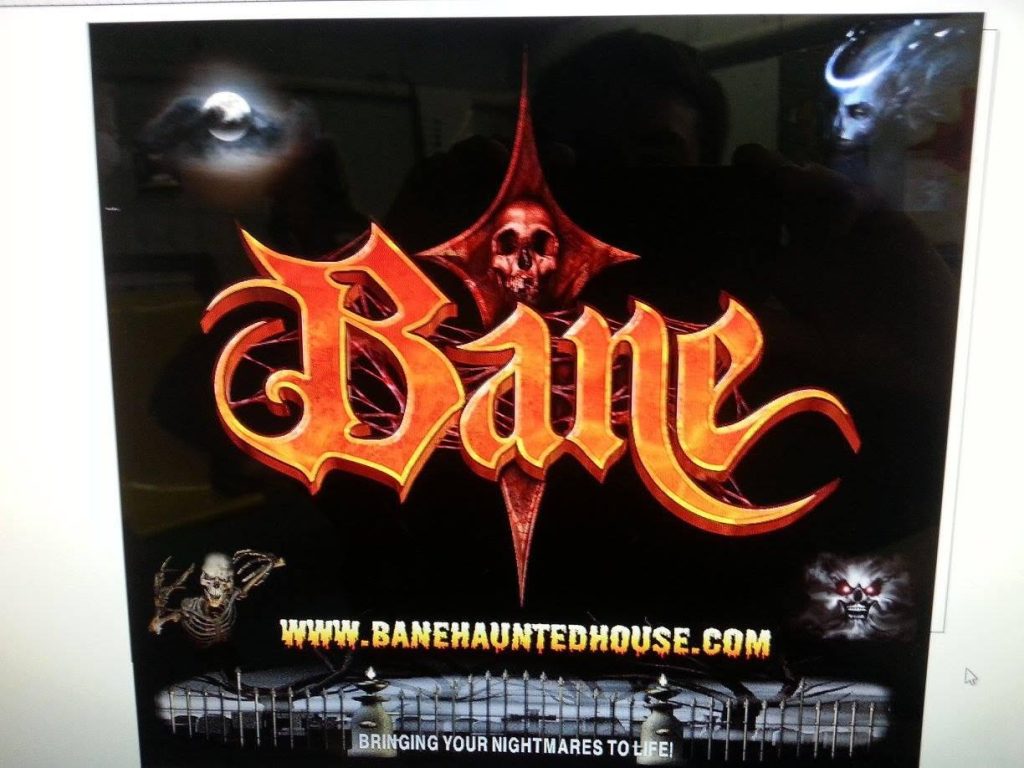
Building one logo that works from a door badge to a trailer side
A small-business logo might appear a few inches tall on a hard hat sticker and several feet long on a trailer in the same week. Few logos handle that range without changes, so a working logo is really a small family of versions drawn from the same artwork.
- Primary lockup: the full logo with the business name, used where there is room, such as a trailer side or a building sign.
- Horizontal and stacked versions: the same parts rearranged so the logo fits a long, low space (a box truck rub rail area or a banner) and a squarer space (a pickup door or a shirt chest).
- One-color version: a version with no gradients, shadows or color overlaps, so it can be cut from a single vinyl color or printed with one screen-printing ink.
- Reversed version: light artwork made for dark backgrounds, drawn on purpose rather than just inverted, because thin dark details tend to fill in when they turn light.
- Small-use mark: a simplified symbol or monogram for spaces where the full name would be unreadable, such as a sleeve, a mirror cap or a social media icon.
Why a simpler logo is easier to reproduce
Lombardo Lettering started in 1940 with Frank Lombardo Sr. painting signs, pinstripes and murals by hand, long before vector software. The material has changed since then, but the practical question has not: can the design be reproduced cleanly at every size it will be used? A logo built from solid shapes, a clear typeface and a small number of flat colors can be cut from single colors of vinyl, printed with a few inks and matched again later. Gradients, shadows and photo effects push the same logo toward printed film for every use.
Vector versus raster artwork, and which file each vendor will ask for
The most common problem with existing logos is the file, not the design. Adobe explains the difference this way: vector files use mathematical equations, lines and curves with fixed points to produce an image, so they can be resized without losing quality, while raster files are made of pixels that show when the image is enlarged. A logo saved as a small JPG may look fine on a phone and fall apart when it is blown up to fit a truck.
Vector artwork is also what a vinyl cutter needs, because the cutter follows the paths in the file. A raster logo has to be redrawn or vectorized before it can be cut in vinyl at any size. The finished set of files should cover every vendor you are likely to deal with:
- AI (Adobe Illustrator): Adobe describes it as commonly used in print media and digital graphics such as logos. Keep the editable master even if you cannot open it yourself.
- PDF (vector): Adobe notes many printers use PDF as a standard for printing, and it is the easiest file to email to a sign shop or print shop.
- EPS: an older vector format that some vendors still request. Adobe notes EPS does not support transparency the way more modern formats like AI do, so check the file after export.
- SVG: an XML-based vector format suited to websites. The W3C defines SVG as a language for describing two-dimensional vector and mixed vector/raster graphics, so make sure the file you send actually contains vector paths and not just an embedded photo.
- PNG and JPG: raster copies for screens, documents and social profiles. Useful, but not the file to send for a truck, sign or banner.
Letter height and contrast rules for signs, interiors and screens
Legibility is measured, not guessed. Each surface a logo lands on has its own published guidance, and good layouts start from the reading distance rather than from how big the artwork looks on a monitor. Vehicle-specific markings such as the business name, USDOT number and size rules for commercial trucks are covered on the truck lettering and NJ vehicle lettering law pages, so this section covers everything else.
Outdoor signs and banners read from the road
The federal highway sign manual gives a starting ratio. The 2009 edition of the MUTCD, Section 2A.13, says a minimum ratio of 1 inch of letter height per 30 feet of legibility distance should be used, and that abbreviations should be kept to a minimum. By that ratio, a business name meant to be read from 300 feet away needs letters about 10 inches tall. The MUTCD is written for traffic signs, not business signs, but the ratio is a sensible floor for custom signs and banners seen by drivers.
Interior signs that fall under the ADA
Interior room, directional and informational signs fall under the 2010 ADA Standards. The US Access Board guide says characters must contrast with their background, light-on-dark or dark-on-light, with a non-glare finish, and must use conventional forms, not italic, oblique, script, highly decorative or other unusual forms. Minimum visual character heights depend on mounting height and viewing distance: 5/8 inch for signs 40 to 70 inches above the floor viewed from under 6 feet, 2 inches for signs above 70 inches and up to 10 feet viewed from under 15 feet, and 3 inches for signs above 10 feet viewed from under 21 feet, each adding 1/8 inch per foot of extra distance. Signs labeling permanent rooms and spaces, and exit doors, also need tactile characters. A decorative brand font may be fine on the truck and still be the wrong choice for an office door sign.
Websites, invoices and screens
For on-screen text, W3C WCAG 2.1 Success Criterion 1.4.3 sets a contrast ratio of at least 4.5:1, or 3:1 for large text (18 point, or 14 point bold). Text that is part of a logo or brand name is exempt, but the tagline, phone number and service list next to it are not. Choosing brand colors with enough contrast from the start means the same palette works on the website, the truck and the sign.
Matching brand colors across vinyl, printed graphics and fabric
A brand color is a specification, not a screen color. The same red can come out three different ways on a truck, a banner and a shirt unless each version is pinned to a named reference. Pantone’s Formula Guide shows its 2,614 spot colors on both coated and uncoated paper stock so designers can see how each color will actually appear on each surface, which is a reminder that one color number does not guarantee one appearance.
Solid-color cut vinyl adds another limit, because film comes in fixed palettes. Orafol’s ORACAL 751C High Performance Cast, which the manufacturer lists for car, truck, van and trailer graphics, comes in 81 colors in a gloss finish, and Orafol publishes a color chart with sRGB values and ICC color profiles for it. That makes it practical to choose the nearest stocked film color during design rather than discovering a mismatch at install. When no stocked color is close enough, Avery Dennison offers a color matching service based on a PMS or RAL code or a physical sample, with minimum order requirements.
Cut vinyl or printed panel for a logo
Flat-color logos are usually cut from solid colored cast film. Logos with gradients, photos or many colors are printed onto white film and laminated. Material choice matters for both. Avery Dennison’s Instructional Bulletin 6.40 (Revision 7) says printed vehicle graphics are designed to adhere to the vehicle’s paint for up to 5 years with its MPI 1105 cast films, up to 2 years with MPI 1902 removable cast and up to 1 year with MPI 2105 calendered films. The same bulletin says calendered film can shrink after heating and stretching, that convex curves such as rivets should be avoided with calendered film, and that cast films are preferred for contoured surfaces. Lombardo Lettering uses premium cast films from Avery, 3M or Orafol, not cheap calendered vinyl.
Shirts, hats and other fabric
Garments are a different surface again, and the color of the shirt itself sits under or around the design. Simplifying the logo to its one-color or two-color version for shirts and apparel is usually easier to keep consistent with the truck than trying to reproduce every shade.
Why Lombardo
Graphic design, done at your yard
We bring the shop to you, so your vehicle keeps working while we do the job. Call Frank for a straight answer, or send a photo and we will reply with a price.
- Talk to Frank directly — most quotes take one phone call
- Priced from a photo of your vehicle or space
- Three generations of sign work, since 1940
Keeping a fleet and its signs consistent year after year
Consistency breaks down slowly. A second truck is lettered from a phone photo, a banner printer guesses at the blue, a new hire orders shirts from a screenshot, and after a few years the business has four versions of its own logo. The fix is a short written brand spec that travels with the artwork files.
A useful spec for a contractor or service business fits on one page: the vector master files, the Pantone references, the exact vinyl film names and color codes used on the vehicles, the typefaces, the approved lockups, and the measured position and size of the lettering on each vehicle type. With that sheet, a truck bought several years from now can be lettered to match the ones already on the road, and the fleet lettering program has something fixed to work from. It also lets any other vendor, from a website developer to an embroidery shop, start from the same source.
Who owns a commissioned logo: copyright and trademark basics
Paying for a logo does not by itself make you the copyright owner. According to the US Copyright Office’s Circular 30, a work is made for hire in only two situations: when an employee prepares it within the scope of his or her employment, or when it is specially ordered or commissioned for one of nine listed uses and both parties sign a written agreement saying it is a work made for hire. The nine are a contribution to a collective work, part of a motion picture or other audiovisual work, a translation, a supplementary work, a compilation, an instructional text, a test, answer material for a test, and an atlas. A business logo is not on that list.
That means ownership of a commissioned logo normally passes by a written transfer. Under 17 U.S.C. 204(a), a transfer of copyright ownership, other than by operation of law, is not valid unless it is in writing and signed by the owner of the rights or that owner’s authorized agent. When you have a logo designed by anyone, ask for a signed transfer of copyright along with the files.
Trademark is a separate question. The USPTO says a trademark can be any word, phrase, symbol, design or combination of these that identifies your goods or services, and you become an owner as soon as you start using it with them. You may put TM (goods) or SM (services) next to the logo without filing anything, but the registered symbol is only for federally registered marks. The USPTO says a registered mark has broader rights and protections than an unregistered one. This is general information from the agencies, not legal advice, so talk to an attorney about your own mark.
How a Lombardo Lettering design job runs, from files to proof to install
Lombardo Lettering, Inc. is a family-owned business founded in 1940. Frank Lombardo Jr. took over from his father and moved the shop into cut vinyl, printed wraps and adhesive graphics, and his son Tristan now works alongside him as the third generation.
For vehicles, the layout is drawn on a template of your actual truck, van or trailer and sent to you as a proof. Nothing is cut until you approve it. Installation happens where the vehicle is parked: your yard, driveway, job site or municipal garage, anywhere in Morris, Essex, Warren, Union, Bergen, Somerset, Sussex and Hunterdon counties. If lettering will do the job, you will not be pushed into a full vehicle wrap. The same artwork can go on to vinyl window and wall lettering, signs, banners and shirts.
To start, call 973-214-2292 and ask for Frank, email franksignguy@yahoo.com, or use the quote form. Send whatever logo files or photos you have, a photo of the vehicle or sign location, and the wording you want. Shop visits at 95 W Main St in Chester, off Route 206 and Route 24, are by appointment. See the service areas page for the towns covered, or the gallery for finished work.
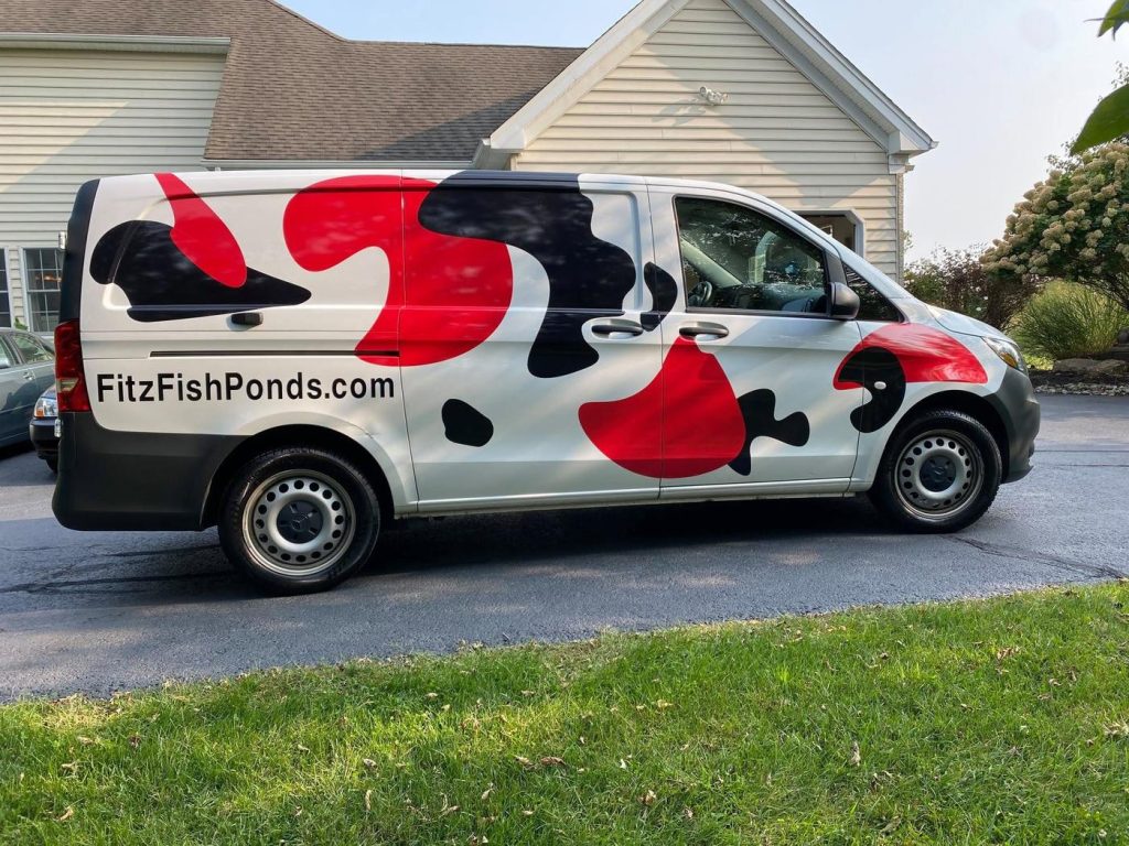
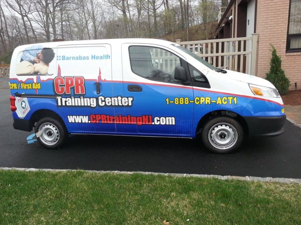
Our work, up close
Graphic Design — questions we get asked
Can you turn my logo from a business card or photo into usable artwork?
Usually, yes. A logo that only exists as a scan, photo or small JPG can be redrawn as vector artwork, which is what a vinyl cutter follows and what printers need for large sizes. Raster images are made of pixels that show when enlarged, while vector paths can be resized without losing quality. Send the clearest copy you have, and any old print pieces that show the true colors.
What file formats should I have for my logo?
Keep a vector master (AI), a vector PDF for printers and sign shops, an EPS for vendors who still ask for it, and an SVG for your website. Add PNG and JPG copies for documents and social media. Adobe notes EPS does not support transparency the way AI does, so the AI and PDF files are the ones to rely on for production.
How big should the letters be on a sign so drivers can read it?
A common starting point is the federal highway sign ratio from the 2009 MUTCD: at least 1 inch of letter height for every 30 feet of reading distance. A name meant to be read from 300 feet needs letters around 10 inches tall. Contrast and a plain, bold typeface matter as much as size. Truck lettering has its own rules, covered on the truck lettering page.
Will my truck lettering match the colors on my shirts and signs?
It can be close if each material is tied to a named reference. The design should list a Pantone color for print, a specific film name and color code for vinyl, and a simplified version for fabric. Pantone shows its colors on both coated and uncoated stock because the surface changes how a color looks, so expect small shifts between materials and approve samples where the match matters most.
Do I own the logo if I pay someone to design it?
Not automatically. The US Copyright Office’s Circular 30 limits commissioned works made for hire to nine listed categories with a signed agreement, and a business logo is not one of them. Under 17 U.S.C. 204(a), a transfer of copyright must be in writing and signed by the owner. Ask any designer for a signed copyright transfer along with the production files, and speak with an attorney about your specific situation.
Should I put TM or the registered symbol next to my logo?
According to the USPTO, you can use TM for goods or SM for services without filing anything, because you become a trademark owner once you start using the mark with your goods or services. The registered symbol is only for marks that are federally registered. A registered mark has broader rights and protections than an unregistered one, so it is worth discussing with a trademark attorney if the name matters to your business.
Can I see the design on my vehicle before you cut it?
Yes. Vehicle layouts are drawn on a template of your actual vehicle and sent to you as a proof. Nothing is cut until you approve it, so you can check the size, placement, colors and wording first. Once it is approved, the graphics are cut from Avery, 3M or Orafol cast film and installed at your yard, driveway or job site.
Do I need a full wrap to show off a new logo?
Not usually. A flat-color logo, business name and phone number in cut vinyl often does the job on a pickup, van or box truck. Printed panels are useful for logos with gradients or photos, and a full wrap makes sense when the whole vehicle is meant to carry the design. Lombardo Lettering will not upsell a full wrap when lettering would do.
Ready for a quote?
Call 973-214-2292 and talk to Frank directly.
Areas we serve across New Jersey
Eight counties. Pick yours to see the towns we cover. Mobile truck lettering, wraps and signs — we come to your yard.
Find us in Chester, NJ
Our shop is at 95 W Main Street, Chester, New Jersey 07930 — but for lettering and wraps, we come to you.
Our mobile service area
Eight counties across northern and western New Jersey, covered by our own trucks.